Page 1 of 3
Which team logo is the coolest??
Posted: Sun Dec 20, 2009 12:09 pm
by Goldfishdude
I was perusing thru the
www.mnhockeyhub.com website looking at scores, and they do an awesome job having the HS team logos on the Team Pages and next to the scoreboard portion.
I have always taken a liking to my WBL Bears logo, as well as the Edina Hornets logo....
I absolutely love the Osseo Orioles hockey logo - similar to Goldy Gopher Hockey logo. As a general fan of sports, that is one logo I would wear just from a fan standpoint. I think the Chaska/Chanhassen logo is pretty cool. The plain M for Minnetonka or a picture of a Mustang don't do it for me.
Including/Excluding your own team's logo, I would be curious to get input on what others might think are some of the cool logos in HS hockey, one that you would wear, even though it's not necessarily the team you support.
Posted: Sun Dec 20, 2009 1:11 pm
by PowerForward25
I love the Burnsville B logo. I don't know why but i have always liked it. Hastings has some nice jersey's this year as well. I know this is unrelated but i HATE WBL's bright orange breezer covers. Those have got to go.
Posted: Sun Dec 20, 2009 1:20 pm
by GordonBombay
PowerForward25 wrote:I love the Burnsville B logo. I don't know why but i have always liked it. Hastings has some nice jersey's this year as well. I know this is unrelated but i HATE WBL's bright orange breezer covers. Those have got to go.
Do they still wear those? Haven't been to one of their games this year and can't seem to remember what they wore for the Hill FSN game.
Posted: Sun Dec 20, 2009 2:21 pm
by chester1991
I think North St Paul with a Polar bear with skates and a stick. Did North St Paul get that jersey first or the Pittsburgh Penguins? Best jersey in high school hockey.
Posted: Sun Dec 20, 2009 3:05 pm
by GoolieMan
I think one of the best logos is the old Hastings Raiders Pirate. I don't know why the school got rid of such a sweet logo. with the pirate swords behind the actual face brought the whole logo together.
Posted: Sun Dec 20, 2009 3:31 pm
by Goldfishdude
chester1991 wrote:I think North St Paul with a Polar bear with skates and a stick. Did North St Paul get that jersey first or the Pittsburgh Penguins? Best jersey in high school hockey.
That was the other one I liked, although, because it's just White and Red (couldn't tell if any black, too) a little bland, but cool nonetheless.
I think, as with Roseville Raiders changing its logo to a cat/rat version, there was probably scrutiny about the persona the Pirate logo was representing.. yeah, yeah, it's a joke people get offended.
Yes the Burnsville B is nice, too...
In terms of WBL and it's orange shells, there are many kids who don't like them.... Stick w/ the black...
Re: Which team logo is the coolest??
Posted: Sun Dec 20, 2009 3:42 pm
by defense
Goldfishdude wrote:I was perusing thru the
www.mnhockeyhub.com website looking at scores, and they do an awesome job having the HS team logos on the Team Pages and next to the scoreboard portion.
I have always taken a liking to my WBL Bears logo, as well as the Edina Hornets logo....
I absolutely love the Osseo Orioles hockey logo - similar to Goldy Gopher Hockey logo. As a general fan of sports, that is one logo I would wear just from a fan standpoint. I think the Chaska/Chanhassen logo is pretty cool. The plain M for Minnetonka or a picture of a Mustang don't do it for me.
Including/Excluding your own team's logo, I would be curious to get input on what others might think are some of the cool logos in HS hockey, one that you would wear, even though it's not necessarily the team you support.
I personally don't like the "postcard" look. Logos and jerseys that are too complicated don't do it for me. Keep it simple. Moorhead's "M" and Alexandria's A ...orange on black and red on black always are sharp. The East Grand Forks "E" is tasteful. When Fergus Falls uses a plain "FF" especially in a gold jersy I like that....I don't like how Fergus and Little Falls have whent away from their second color...gold. Fergus now has just maroon and white and now LF just has purple and white.
Posted: Sun Dec 20, 2009 3:51 pm
by mn miracle man
A few good ones I can think of off the top of my head are the Buffalo Bison, resembles the Sabres NHL logo and would be even better with a color other than purple. Another one is the Pioneers of Hill Murray, especially those new jerseys they were sporting against WBL last week.
Posted: Sun Dec 20, 2009 4:15 pm
by brandy38
It's not like they're a historic program or anything but Maple Grove's jerseys last year with the leaf in the center of them were pretty cool. Are they wearing them this year?
South St. Paul's steer head is rather unique to other schools.
Warroad's logo has always been arguably my favorite, though.
Posted: Sun Dec 20, 2009 4:41 pm
by PowerForward25
GordonBombay wrote:PowerForward25 wrote:I love the Burnsville B logo. I don't know why but i have always liked it. Hastings has some nice jersey's this year as well. I know this is unrelated but i HATE WBL's bright orange breezer covers. Those have got to go.
Do they still wear those? Haven't been to one of their games this year and can't seem to remember what they wore for the Hill FSN game.
I know they did last year. I don't know about this year though.
Posted: Sun Dec 20, 2009 5:38 pm
by PoniesDad45
chester1991 wrote:I think North St Paul with a Polar bear with skates and a stick. Did North St Paul get that jersey first or the Pittsburgh Penguins? Best jersey in high school hockey.
I agree, I love the Polars colors and logo.
How can the best one be any other than the St Paul Saints?

Posted: Sun Dec 20, 2009 6:07 pm
by nhl_combine
I don't know if they still use it, but the Elk River Elks home white jersey with the Elk head snorting smoke out is pretty sweet. Also the Cloquet Lumberjacks head minus the color purple.
Posted: Sun Dec 20, 2009 6:39 pm
by Goldfishdude
A couple of you guys have mentioned the color purple as to a detraction from logos..... I think there are just some colors that look better on uniforms... and purple is one that doesn't seem to have the best impact...
I also agree the color lettering on the H-M white jerseys looks awesome.....
I wished the St. Paul Saints would have actually stolen the Fighting Saints logo... They did take the S from that logo, tho...
Posted: Sun Dec 20, 2009 7:00 pm
by steelheader
Warroad by far.
Grand Rapids #2
Posted: Sun Dec 20, 2009 7:39 pm
by wblhockeyfan8
I do really like the wolf thing Roseville has adopted, it looked sweet on their goalie's mask on FSN.
Posted: Sun Dec 20, 2009 9:54 pm
by MrBoDangles
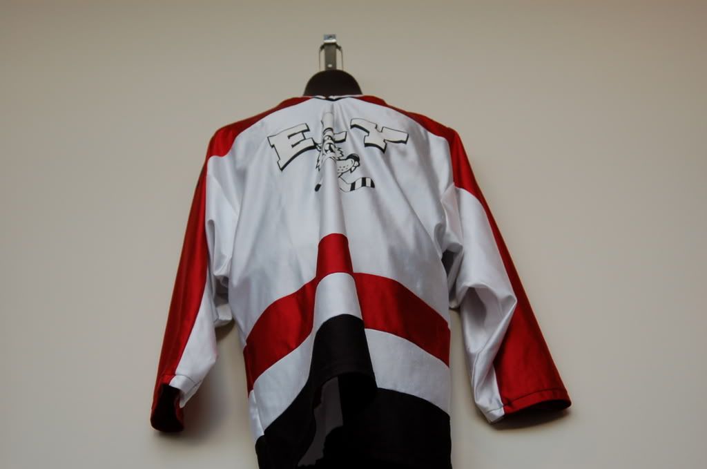
The Ely logo is hard to beat...
Posted: Sun Dec 20, 2009 10:03 pm
by eastside hockey
Park center had a great logo of a pirate on there uniforms.
The old hastings logo was also great.
Two others that come to memory were the lumberjacks, and Minnetonka's old jersey"s.
Posted: Sun Dec 20, 2009 10:30 pm
by MN hockey08
im not from moorhead, but you gotta love the spud!
Posted: Sun Dec 20, 2009 10:56 pm
by Teak
MrBoDangles wrote:The Ely logo is hard to beat...
Yeah, put my vote down for Ely also.

Posted: Tue Dec 22, 2009 9:28 am
by D6Rocks

Mpls Southwest. 1940 - 1987
Posted: Tue Dec 22, 2009 11:13 am
by bjspud12
Posted: Tue Dec 22, 2009 11:39 am
by HShockeywatcher
Albert Lea..
Posted: Tue Dec 22, 2009 12:19 pm
by Northsider
favorite jerseys:
The Old Hill-Murray's:

Edina's:

Warroad's:

Both Duluth East's:


I also really like South St. Paul's, but I can't find a good picture.
Posted: Tue Dec 22, 2009 1:29 pm
by D6Rocks

I'm not sure I love South St Paul's.
Posted: Tue Dec 22, 2009 7:36 pm
by Teak
Why didn't the photographer have the sense to pull the jersey flat before taking the picture?